Info on Infographics
We’ve all been there – you’re reading through a block of heavy text online, and as you continue scrolling, your mind starts to wander. By the time you’ve reached the end of the article, you realize you haven’t actually processed anything you’ve read; you’ve only skimmed the content as your mind refocuses on what to have for lunch.
Text exhaustion: it’s a thing. Well, maybe not the kind of thing you can Google, more like a term we just invented, we suppose. Regardless, reading long, fact-heavy articles can grow tiring. Enter infographics, a new weapon to add to your storytelling arsenal.
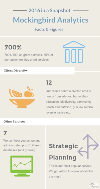
Infographics are the visual representations of important facts and figures. Using eye-catching colors and images can make content more memorable, engaging, and easy to understand. When you need to get a point across to potential donors, supporters, or clients, constructing an infographic may be the answer.
Consider the following tips when creating an infographic:
1) Think about your audience. Choose images and terms that will appeal to your demographic. If you’re sending the infographic to donors, be professional and concise, and use concrete data and numbers when possible. If the infographic is meant for community members, you may want to maintain a more conversational tone and appeal to emotions.
2) Don’t get too wordy. Don’t crowd your infographic with too much text; it makes it more difficult and intimidating to read. An infographic should be more approachable than an article. Use succinct text to clearly convey your main points, but let the illustrations do most of the work.
3) Make it clear. In general, the more simple and easy to follow, the better. If your infographic requires too much deciphering, a reader will likely lose interest before gleaning any useful information from it.
4) Watch your fonts. Keep your fonts large enough to read without squinting. If the infographic is on a website, make sure all text is readable without zooming in.
5) Keep it short. It’s tough to grab someone’s attention, but it can be even harder to maintain it. Once you’ve got eyeballs on your infographic, don’t lose them! If your infographic will be printed out, keep it to one page. If it’s displayed on a website, it should appear on one screen. Should you need to scroll, it’s likely too large. Consider rethinking your format.
6) Embed it! If your infographic will live online, embed it somewhere prominent on your website so it’s more easily shareable. View it on a mobile device to be sure it’s still impactful when seen on a phone screen. If you are sending your infographic out in an email, embed it in the body rather than attaching it as a PDF. Again, this makes it simpler to share.
7) Have fun! Infographics can make it easier to digest information one might deem boring in another format. Use color and images to your advantage.
We hope these help you avoid text exhaustion. Check out online tools like visme.co or venngage.com to create your own infographics. You can also reach out to Mockingbird Analytics if your nonprofit needs assistance in crafting further engaging content. We’re here to help!

